I found this technique on Rich Benner's SQL Server Blog: Visualising the Marvel Cinematic Universe in T-SQL and decided to play around with it after someone asked me to give him the sizes of all databases on a development instance of SQL Server
The way it works is that you take the size of the database and then divide that number against the total size of all databases. You then use the replicate function with the | (pipe) character to generate the 'graph' so 8% will look like this ||||||||
You can use this for tables with most rows, a count per state etc etc. By looking at the output the graph column adds a nice visual effect to it IMHO
Here is what the final query looks like
SELECT
       database_name = DB_NAME(database_id)
     , total_size_GB = CAST(SUM(size) * 8. / 1024/1024 AS DECIMAL(30,2))
  , percent_size = (CONVERT(decimal(30,4),(SUM(size) /
     (SELECT SUM(CONVERT(decimal(30,4),size))
     FROM sys.master_files WITH(NOWAIT)))) *100.00)
  , graph = replicate('|',((convert(decimal(30,2),(SUM(size) /
    (SELECT SUM(CONVERT(decimal(30,2),size))
     FROM sys.master_files WITH(NOWAIT)))) *100)))
FROM sys.master_files WITH(NOWAIT)
GROUP BY database_id
ORDER BY 3 DESC
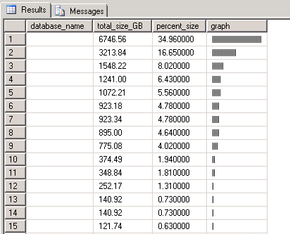
And here is the output (I blanked out the DB name in the output below), there are 48 databases, 15 of them show a bar, the rest don't because they use less than 0.5% of space.
Do you see how you can quickly tell visually that the top DB is about twice as large as the next DB?
Those guys in Lascaux would have been so proud, only if they could see this :-)
